Monday, November 18, 2013

A little bit more on printmaking

This week I posted about etching, drypoint, linocut, and woodcut as methods for making durable, quality prints by hand. I also experimented recently with "soft ground" etching, which delighted me by producing a print that looks like a drawing.

"Soft ground" is a softer version of the "hard ground" wax used for etching. When etching with hard ground, one must use a needle to scratch the image into the hard wax. For this technique, one can press a design into the soft ground with a pencil. One transfers the image by drawing on a piece of newsprint placed over the wax-coated metal plate. The wax will stick to the other side of the paper, leaving a duplicate image on the plate, ready to be exposed to the acid.

I lay this little sketch (based on a drawing I made last summer, at the Kenai River) on top of a plate waxed with soft ground. I went over it with a pencil, pressing my marks into the wax.


 When I lifted my drawing off the plate, this image, in wax, appeared on the reverse of my paper:


Wherever the wax stuck to the paper, the plate was exposed. Into the acid bath it went. Then I inked it and ran it through the press with a piece of wet paper. Here is the print:


Now I can make as many of these as I want! Neat, isn't it? 

I like this image a lot, but I liked the soft brown of the wax so much I might print it again using a sepia colored ink. I could also hand color the final print with watercolor to give it the Alaska Landscape finishing touch. Mostly, I want to experiment more with this wonderful, simple way to make prints.

Next post, back to oil painting. I am doing some small pieces (6 x 6, 8 x 8) which will be very affordable, especially if bought unframed. Stay tuned, shoppers.

Sunday, November 17, 2013

A Little Background on Jack Lambert

I mentioned a few posts ago that my grandfather, Jack Lambert, had attended Art Students League. Some readers found that interesting, so I thought it would be fun to post a few pieces of his work.

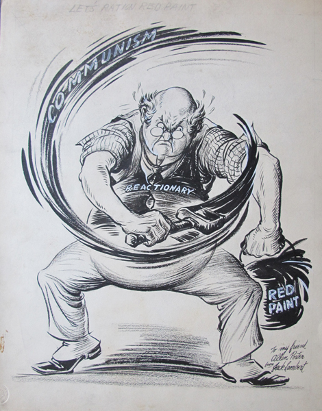
These examples are both inscribed to his friend Allen Porter, who met my grandfather in the 1940's, when Allen, as a very young man, worked at the Chicago Sun. My grandfather also worked at the Chicago Sun, as a cartoonist. Later he moved on to the Baltimore Sun, and stayed there until he retired in the 1960's.

Allen became an accomplished designer, and a member of the Chicago Bauhaus community. He found me online and offered me these pieces, which I readily accepted. He has graciously kept in touch and encouraged me in my work.

This image, an original drawing for a cartoon, dates from about 1943, according to Allen. The issue of red-baiting must have been in the news. The pencilled caption on the cartoon is "Let's Ration Red Paint." As you can see, my grandfather packed a lot of energy into an image, just what a cartoonist needs to do. I love the classic, 20th century look of this character, especially the spats!


Allen also sent me this photograph. My grandfather was an innovator, combining photography, sculpture, and cartooning. He used this same technique on two covers for Look Magazine, illustrating the Democratic and Republican convention coverage. On one, painted clay sculptures of donkeys are running across the page, on the other it's elephants. This example evidently was an illustration for the war bond drive. Two of his sons were in Europe, pilots in the Army Air Corps, at the time.


This little guy has spats too.

I am very pleased to have this photo. Many of my grandfather's sculptures were in clay, and used for purposes such as this. Later he used the clay for new pieces, so none of them has survived. He was a funny guy, and a serious artist. When, as I child, I asked him for advice about how I could become an artist he told me just one thing. "Learn to draw."

Saturday, November 16, 2013

Some corrections, and more on printmaking

I wrote several things in the last post that were not accurate. First, regarding Japanese woodblock prints, I should have noted that they were not printed on a press. Those prints were hand-rubbed onto the paper.

Second, I said that for my color linocut print "Eden" I printed the dark outlines first, then the color sections. In fact, the colors went through the press first, then the outlines were printed on top.

Third, I talked about putting the "Falling Sword" plate into a dye bath, when I should have said acid bath! Alert printmakers will have caught my mistakes. Did my time dying wool gave me a wooly brain?

Now a note about another way to make prints from a copper plate: drypoint.

Drypoint does not require an acid bath, because the grooves are made on the plate directly with a sharp point. The drypoint grooves have edges, like a furrow, which catch the ink and hold it, giving a deep rich tone to the darks. The effect is softer than etching. You can see the difference in two images I made of the same object.

I began to make an etching of a basket, but I didn't like the first state, so I set the plate aside and started over on a new plate. The print is very small, 3 x 4 inches, so I had not lost much effort. Here are some states of the etched basket.

First state:

A state from the middle of the process:


The last state:


I then went back to the plate of my first, failed attempt and used it to experiment with drypoint. While this version began as an etching, you will see that it ended up with softer, darker qualities.


Looking at these last two images, I wonder, which do you prefer? Because these prints are from two different, plates, I could do an edition of either, both, or neither of them.

Here, by the way, are the two plates. The etched basket:


The drypoint basket:


I would love to hear from you. Which one you think would be best for an edition?